Good metrics offer two things: 1) They help you identify how your business is doing and 2) They tell you what to focus on. That's why it's important to have them prominently displayed. They keep you on track!
How metrics evolve
As a company grows, its metrics story gets more complex. In 2019, Segment has over 350+ employees and 60+ teams. Each team focuses on two to five team-level metrics which roll up into two to five company-level metrics.
Every month our strategic finance team distributes a Monthly Metrics Report with over 40+ financial, product, sales, and success metrics that describe the business at a high level.
The report is broken up into five chapters:
Large businesses are inherently complex. As the sheer number of customers, product lines, and teams increase, the number of goals and metrics increase as well. Our analytics and finance teams use business intelligence tools (Mode Analytics + Tableau) on top of a data warehouse (Redshift) to build and monitor metrics that give us a high-level health pulse on the business.
The early years
However, it wasn’t always that complex. In this lesson, we dug into our early history to capture how our metrics evolved over the first few years after launch and the metrics lessons we learned.
Your first metrics
After a lot of iteration on our own key metrics, we've landed on two guiding principles for how to pick 'em:
Choose metrics with clear owners.
Measure rates instead of totals.
How’d we figure it out?
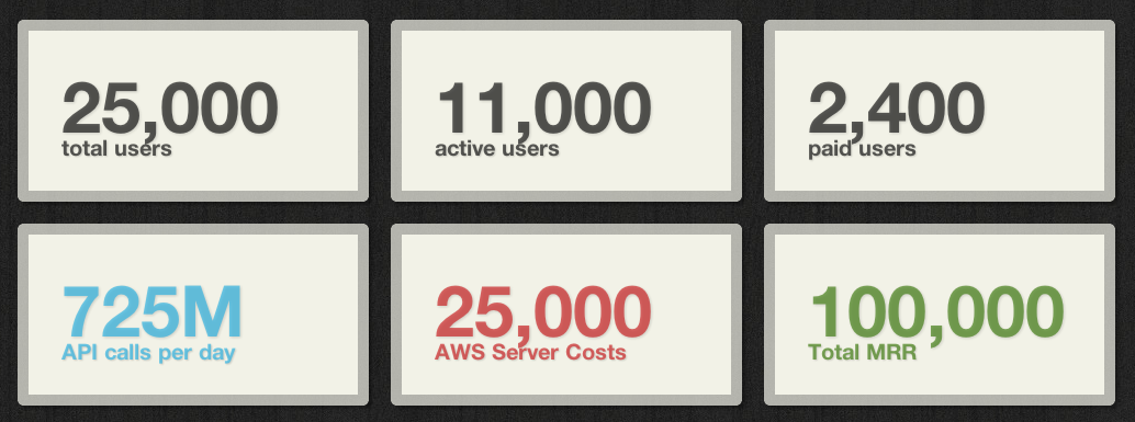
Let’s start with what our dashboard looked like when we first set it up, with our bad metrics:

(Note: these are fabricated numbers)
Seeing all these big numbers was super exciting for the first few days, but once the excitement wore off, we realized the metrics weren't really helpful on a daily or even weekly basis.
Don't use totals
Showing metrics like Total Registered Users on our dashboard was our first mistake. That number will always go up. It's a vanity metric that doesn't help you day-to-day. All you can do with it is jump up and down and say, "We have tens of thousands of registered users! Yay!"
On a daily basis, growth is what matters. When we only had totals, we found ourselves asking, "Soooo... how much did we actually grow this week?" Subtracting totals in your head is tedious, and that's assuming you accurately remember what the number was last week.

(Subtracting totals is hard)
Signups per Week is a much better metric than Total Users, because it immediately answers the question, "did our marketing efforts succeed this week?" The total will always go up, but the only way the weekly rate goes up is if our marketing efforts are working.
Your dashboard metrics should make it impossible to hide from failure.
If you take away one thing from this article, let it be that. That's the secret to dashboards. They put failure and success up in big letters on the wall. Companies are full of experiments and a failed one is nothing to cry about. Just don't do the same broken thing again tomorrow, fix it! A good dashboard with the right metrics will help you call out broken processes and fix them.
If you look again at our first three metrics, you'll see they were all totals. Total users, total active users, total paid users. In the newest version of our dashboard we've changed them to rates: Signups per Week and Connection Rate. These rates tell us immediately whether we're still going strong or whether growth is stalling. If there's any slowdown in growth we want to know about it ASAP.
Choose a time window
When you put a rate on your dashboard, you have to choose a time window. Hourly? Daily? Weekly? Monthly?
Shorter time windows mean you'll learn faster. It takes a full week to see changes in your weekly signup rate, but it only takes 1 minute to see a change in your minutely signup rate. The WhatsApp team sees 700 signups per minute, so they can A/B test their signup form or invite flow every couple minutes. That's incredibly fast feedback. The smaller your time window, the faster you can learn and iterate.
On the other hand, if you choose a time window that's too small, your metric will be too noisy, and become useless. For example, Segment doesn't get any signups for most minutes of the day. Zero-zero-zero-zero-zero-zero-one! That might be exciting, but it's totally worthless. You want a time window where your metric is stable. Once it's stable, you can try pulling levers to see what changes.
For us right now, the perfect time window is weekly. Weekly signups, weekly new active users, weekly new paid users. They're stable unless we change something, and that lets us iterate quickly.
Be sure to choose your time window appropriately for your scale. As your company grows, you can shorten your time windows and increase iteration speed.
All that said, there's an exception to the "rates are better than totals" rule.
Goals are special
There's one place where totals make sense, and that's major company goals. Total Monthly Recurring Revenue is the big exception we make to the "No totals" rule, and that's because it has a big fat goal associated with it: becoming profitable.
The first thing on our dashboard was Total MRR, and we really marveled at it. It feels good. But, it turns out we messed that up too. Total MRR actually has two components, owned by two different teams.
Who owns each metric?
Total MRR seems like a metric for the sales team, right? Well... not quite. We also have lots of self-service revenue, and the sales team doesn't touch self-service revenue at all. The product team owns self-service.
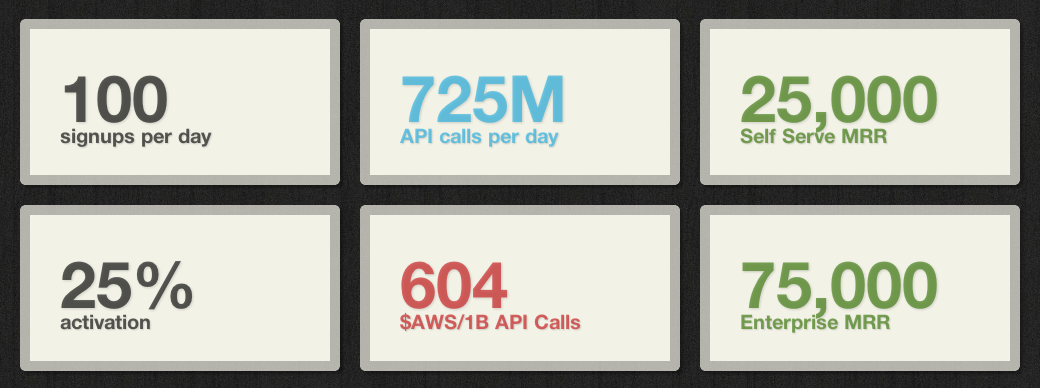
Having a metric that's controlled by two different teams is a problem because it lets one team's failure hide in another's success. If the sales team is killing it, but self-service is converting horribly, we'd never know. The solution is simple: we split the metric in two. Self-service MRR and Enterprise MRR. It's now incredibly clear when each process is working or not.
The other muddy number on our initial dashboard was Server Costs per Month. At first glance, it seems like it's the engineering team's domain. Problem is, as sales and marketing bring in new customers our API volume goes up, which drives up server costs.
Sales and marketing are effectively competing against engineering, so it's nearly impossible to say whether our infrastructure is getting more or less efficient.
What's important for engineering is the ratio of server costs to usage, because that's what they can control and optimize, and that's what dictates our margins! So instead of total server costs per month, we now use Cost per 1 Billion API Calls.
Sales and marketing can bring in as many users as they want, and unless they bring in so many that our servers get bogged down, engineering can stay on track.
The new and improved dashboard
Our main task as a company is to optimize every business function to be faster, smoother, and better for our customers. Every metric on our dashboard is intended to focus our attention on a specific business process we need to optimize.
With that as the driving focus, here are the six metrics we use today:

(Remember, the numbers are fake!)
We display the dashboard on a wall-mounted screen in our office. When we walk to the bathroom we can't help but read it.
It's impossible for us to hide from failure.
Here are some resources to check out for more tips: