Analytics and data collection is a very broad topic and it can be quite overwhelming. How do you get started? Over the last seven years, we've onboarded tens of thousands of companies onto their first analytics setup and we're ready to share our simple method. This is your "install analytics in under two hours" quickstart guide.
Why analytics?
Let's start with the basics, what are we doing here? You install analytics for five core reasons:
To understand your business, your product, and your customers in a numerical way.
Get a non-bullshit view into product market fit: are users getting value and coming back week over week?
Model your business as a funnel + core metrics: when your core metrics grow, so does your business.
Learn the right place to focus: understand where the biggest funnel drop off is and focus your efforts there.
Grow the business: grow the business based on the funnel focus area above.
But mostly because you can't (see) fix what you don't measure.
The quickstart
Here's the five-step quickstart process: 1. Business goals 2. Funnel 3. Collect data 4. Metrics 5. Dashboards
Let's do this!
Business goals
The first action item is to note your business goals. Your business goals focus your data collection and metrics plan around solving those objectives. Here are some common examples to get you started:
I am launching a new product, and I need to understand and improve the following:
I own an existing product and need to understand and grow the product/business.
I own an existing product, but the existing analytics data is too messy to do an analysis.
I want to use new analytics and marketing tools, but integrating new tools is too difficult and time consuming.
I need to answer analytics questions faster.
I need to standardize and clean up data across multiple products or business units.
If one or multiple of these should sound familiar, then you're ready for an analytics refresh. The next step is to define your product's funnel.
Funnel
Pirate metrics AARRR (acquisition, activation, retention, revenue, and referral) define a product's full funnel categories. When starting out, we recommend to just think about the acquisition, engagement, and monetization steps of your customer journey.
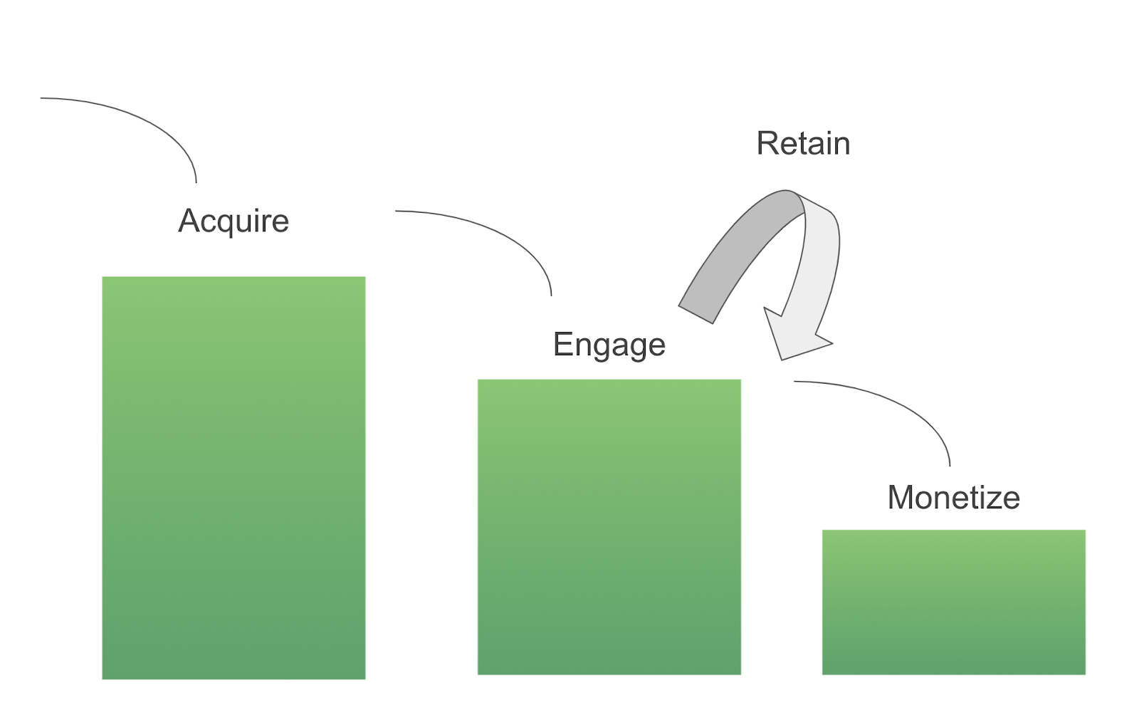
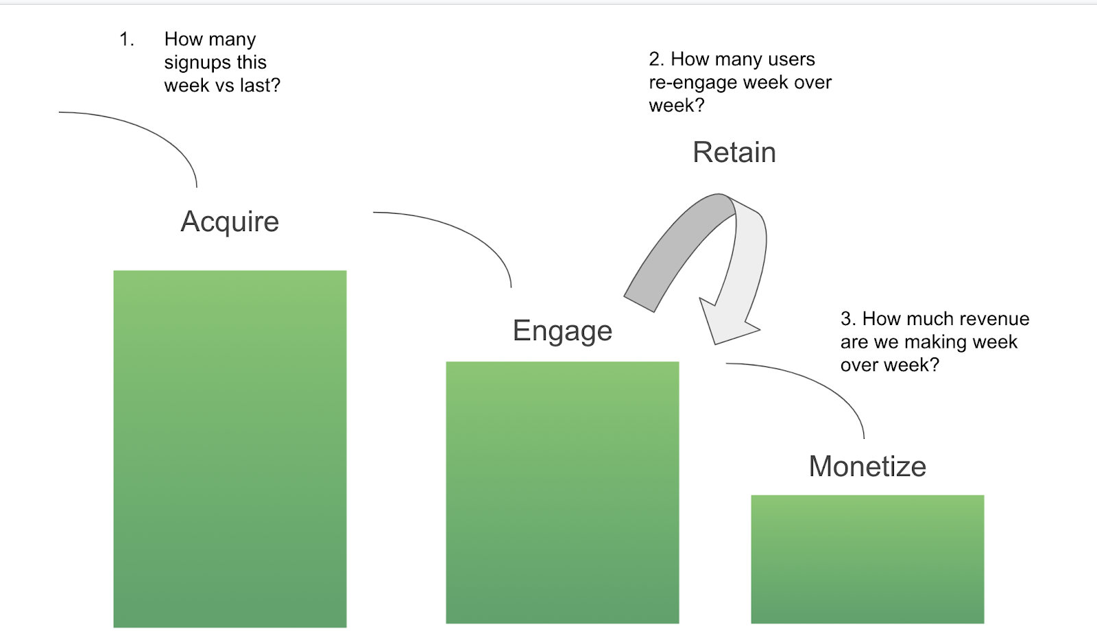
Then we ask three core questions for each of the funnel steps.
Acquisition: how many signups signed up this week vs last?
Engagement: how many users re-engage with the app week over week?
Monetization: how much revenue are we making week over week?
Our goal is to answer all three of these funnel questions by the end of this article.
Collect data
It's time to collect this behavior data so that we can build these metrics in an analytics tool.
The first step is to create a simple tracking plan based on the funnel. Let's use a simple Netflix funnel example:
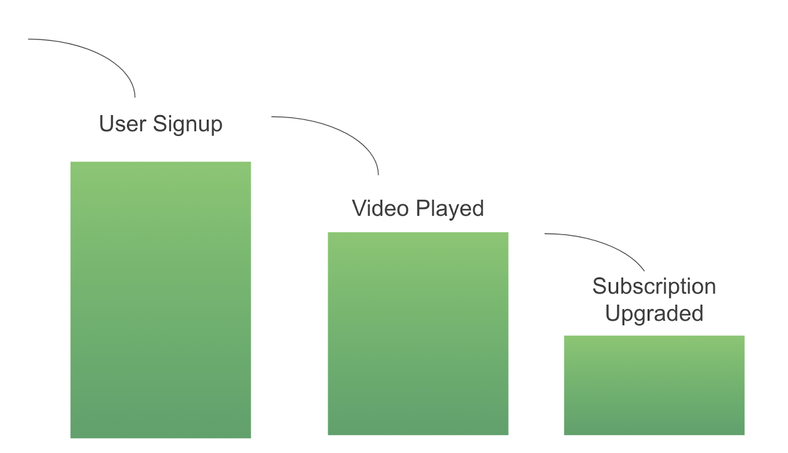
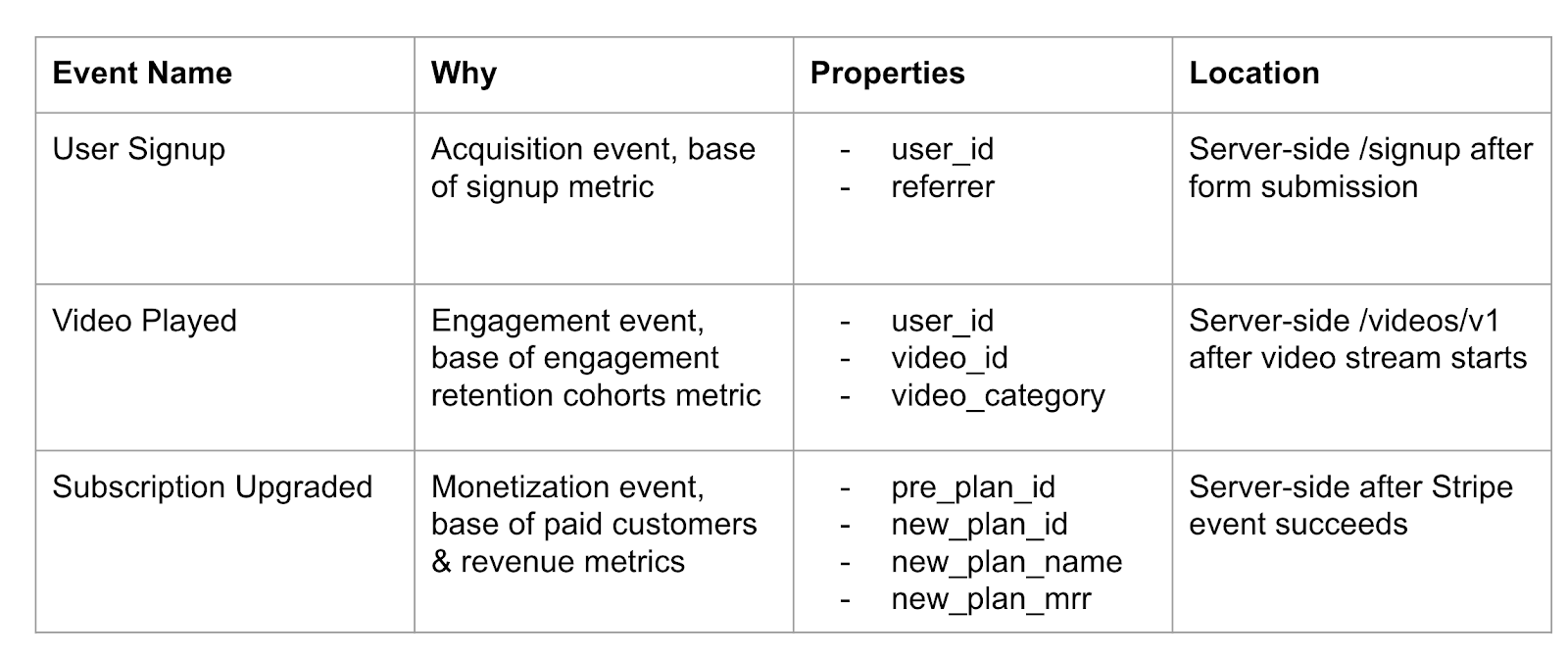
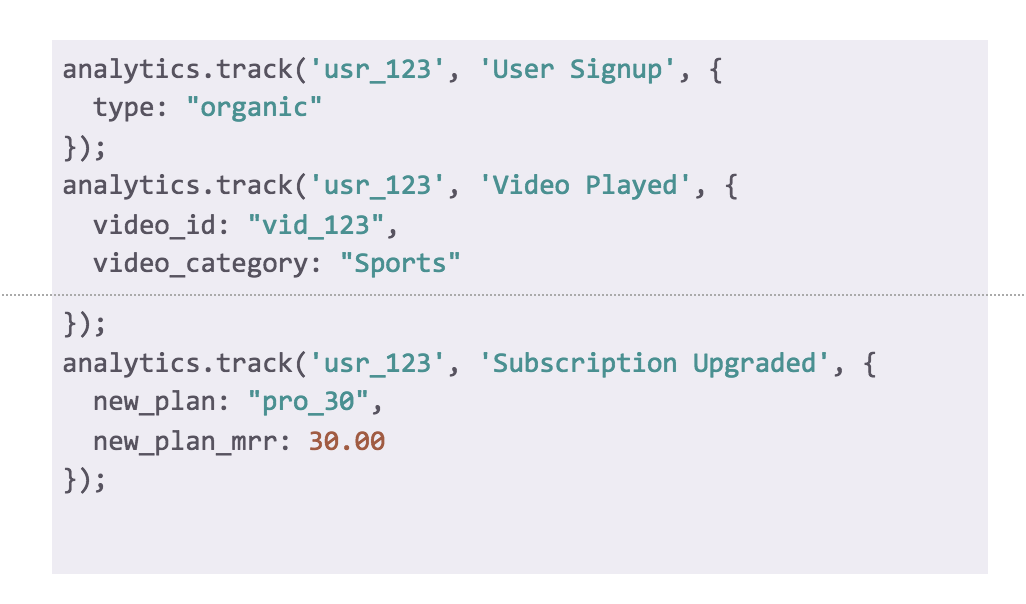
User Signup is the core acquisition event, Video Played is the engagement event, and Subscription Upgraded is the monetization event. Now that we know the three core events that represent the funnel, we can create a simple tracking plan:
Some best practices:
Use the Object Action framework to describe user actions.
Object: User, Action: Signup
Object: Video, Action: Played
Keep simple tracking plans in Google Spreadsheets. If your tracking plan is over 25 events or is shared across multiple teams, you should use a data governance tool like Segment Protocols to standardize the data across the teams.
Check out our client vs server academy article to understand where the best location to track data is.
The tracking plan is your data specification. You can now send it to your engineering team for implementation.
The next step is collecting data via the Analytics API.
Collecting data
Segment's Analytics API uses the analytics.track call to model user events. It also allows you to send dynamic events and event properties of any shape.
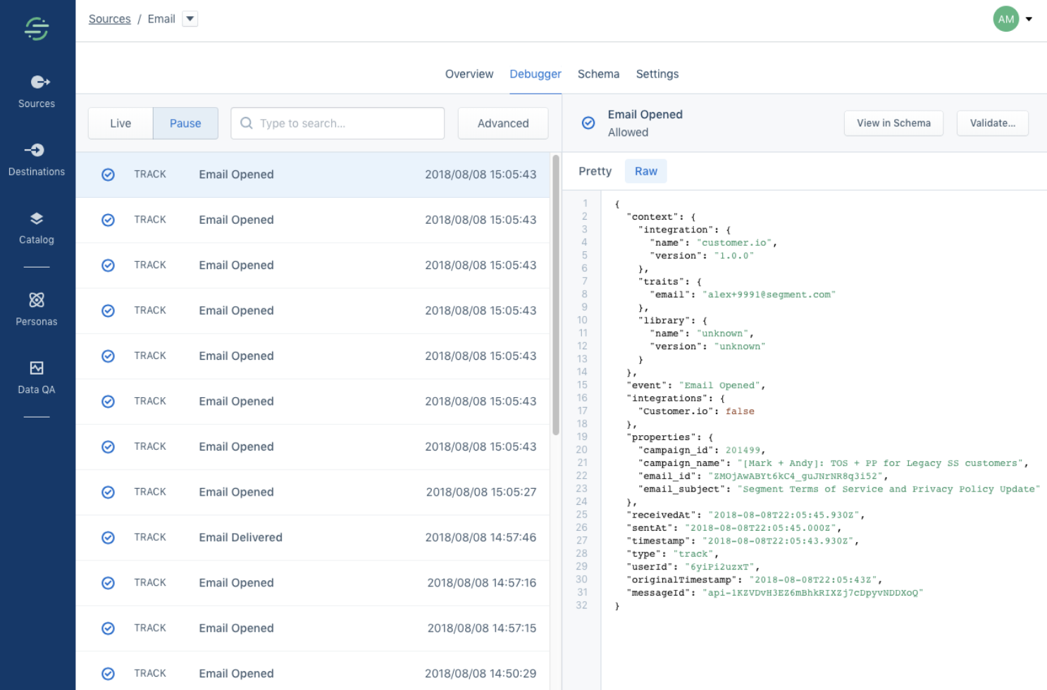
Once your web or mobile app is sending the data to Segment, the next step is to QA the shape of the data. You'll use the Segment Debugger to look at the shape of the data. Use the pretty + raw view to inspect the details.
Analytics tools like Mixpanel, Heap, or Amplitude are the best ways to build your first metrics. These tools all have the ability to graph dynamic events across flexible time windows. In the example below, we'll use Amplitude.
First, you need to enable data flow to Amplitude. Go to your Segment Source, press Add Destination, and add Amplitude and its API key options.

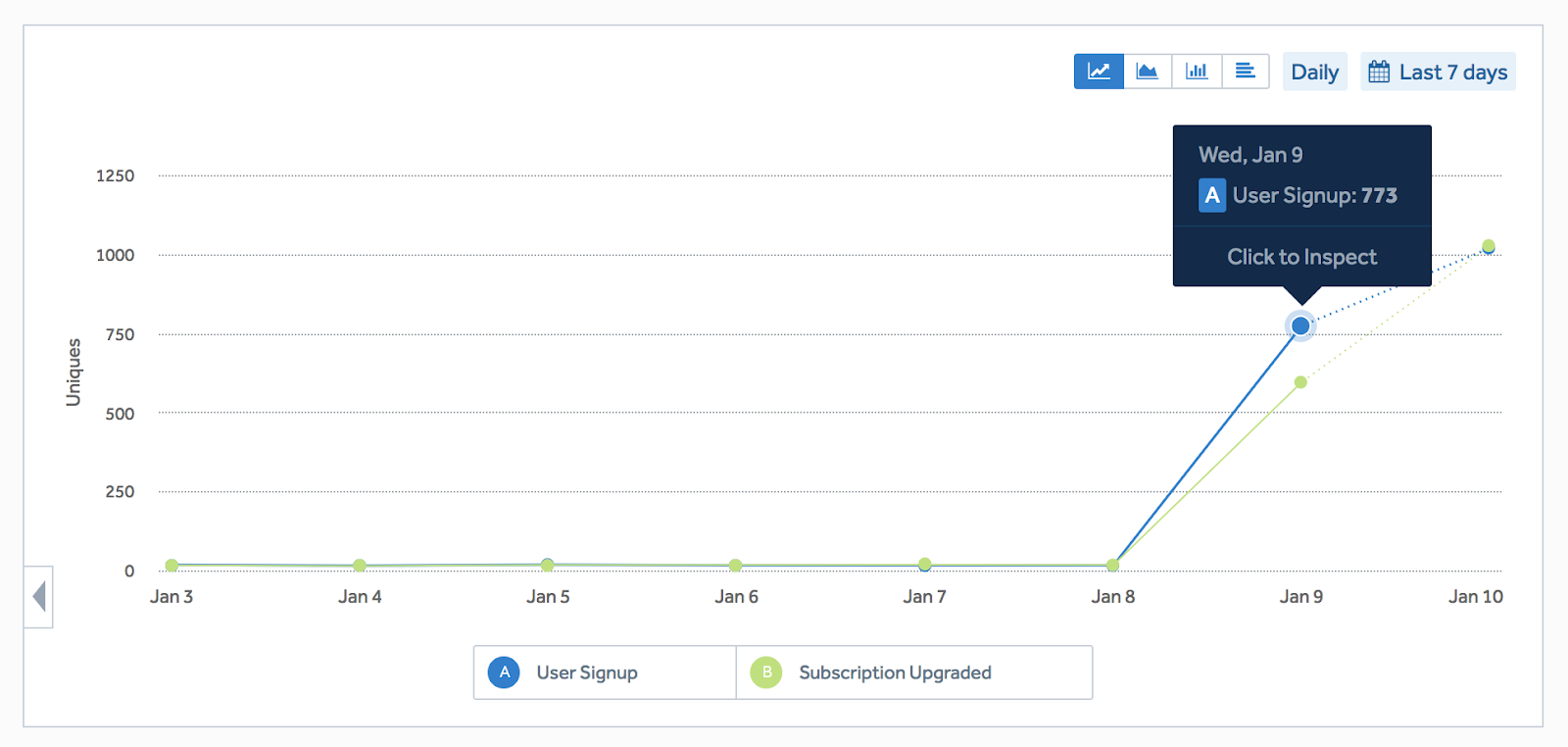
You'll immediately see data flowing into Amplitude. Woohoo!
Metrics
Ok, we're ready to build our first three metrics in our analytics tool.
New Signups (week over week): how many signups signed up this week vs last? (acquisition)
Engagement Retention Cohort (week over week): how many users re-engage with the app week over week? (engagement/retention)
New Revenue (week over week): how much revenue are we making week over week?
Let's jump straight into Amplitude.
1. Signups per week
The first metric we'll create is new signups over week. This one is really easy.
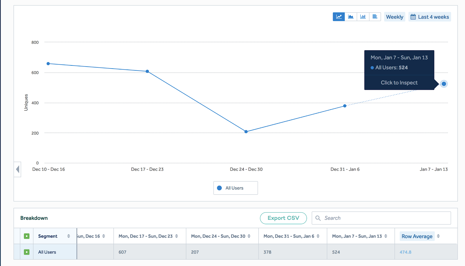
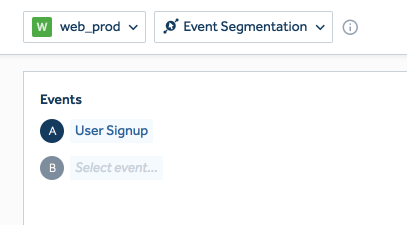
Go to Amplitude and create an Event Segmentation chart and add User Signup as one of the event series.
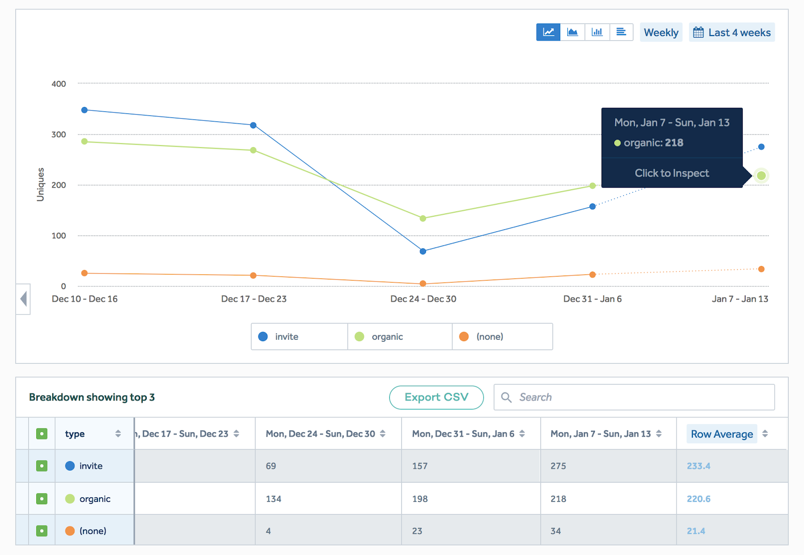
You can also group by an event property like signup type to understand how many signups are invite vs organic.
The result is an actionable graph of new signups week over week. This is similar to a graph that Segment's marketing team looks at every week to understand how many users are signing up.
2. Retention cohorts
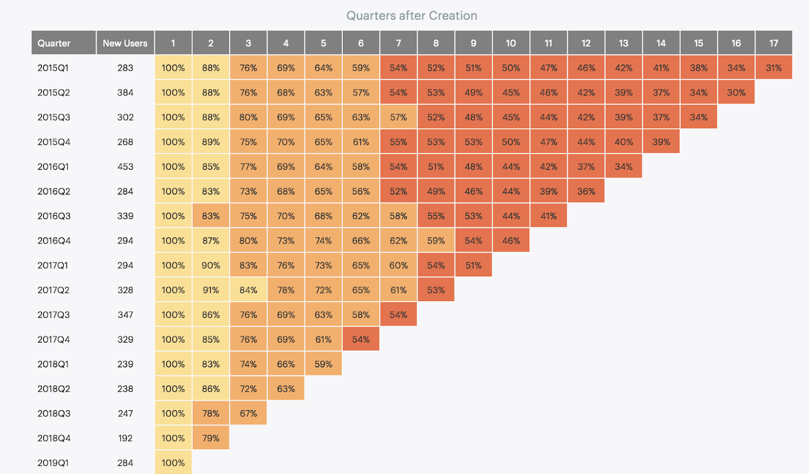
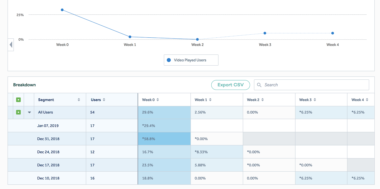
Our next metric is the engagement retention cohort that we'll use to understand what percentage of our users engage with the product week over week after their initial sign up. This is the most important graph to understand product-market fit. We go into detail behind the theory of this graph in the Academy article called Measuring Product-Market Fit.
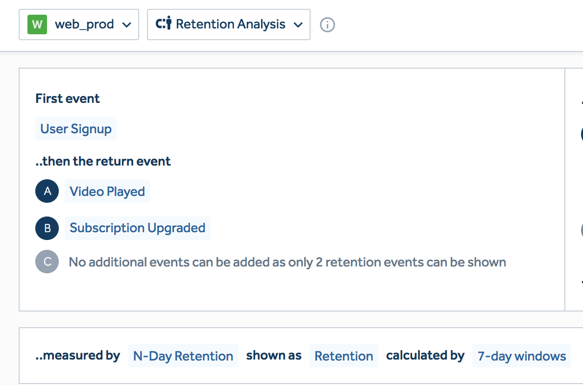
You can use Amplitude to create your first Retention Analysis chart.
You'll select the First Event which causes the user to enter the cohort. Next you'll select the Return Events, which indicate that the user has engaged during the current retention window. We'll use User Signup as the first event, and both Video Played and Subscription Upgraded as engagement events.
N-Day-Retention calculated by 7 Day Windows will allow you to measure the percentage of the initial cohort that comes back week over week.
The resulting chart shows week-over-week retention across weekly cohorts.
3. Revenue
For post-monetization products, revenue is usually the one metric that matters. And the good news is you can build it really easily in Amplitude with the correct tracking plan.
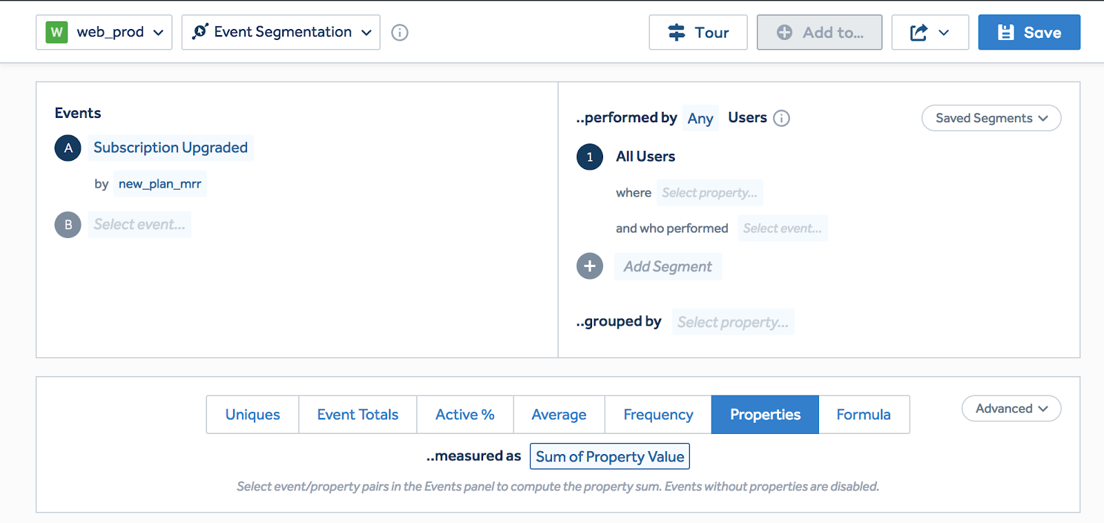
Let's create a similar Event Segmentation graph on top of the Subscription Upgraded method. Instead of counting unique users who have performed the action, press the Properties aggregation of type Sum of Property Value. Select event property: _new_plan_mrr to count all the events.
And just like that, your new revenue week-over-week metric appears!
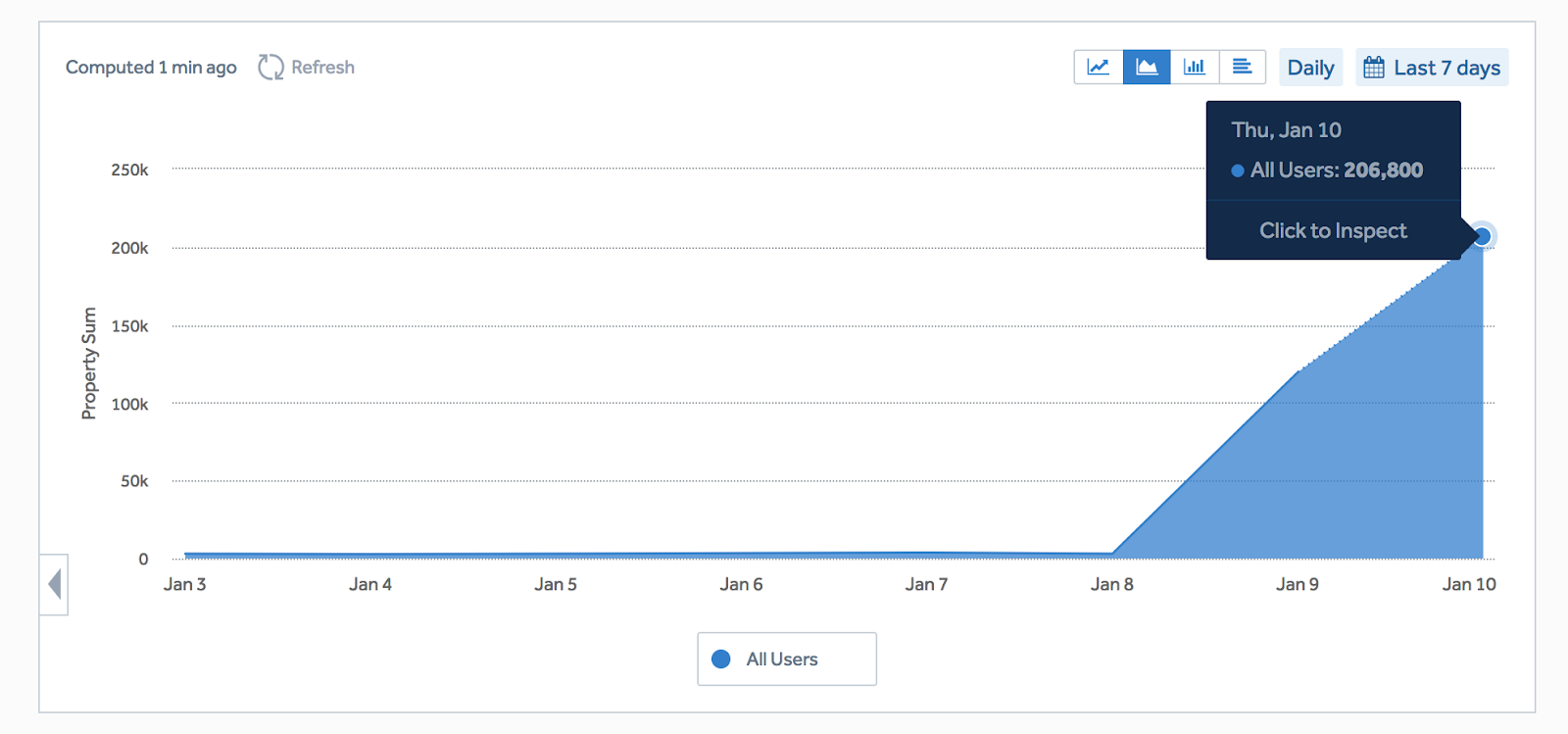
As the business becomes more complex, the definition behind an ARR graph becomes equally complex. Multiple business units mean multiple payment providers and sources of truth. A self-service credit card business is usually backed by Stripe, and a B2B annual business is usually backed by Salesforce data. When you get this advanced, you'll want to switch to a business intelligence tool running on top of a data warehouse.
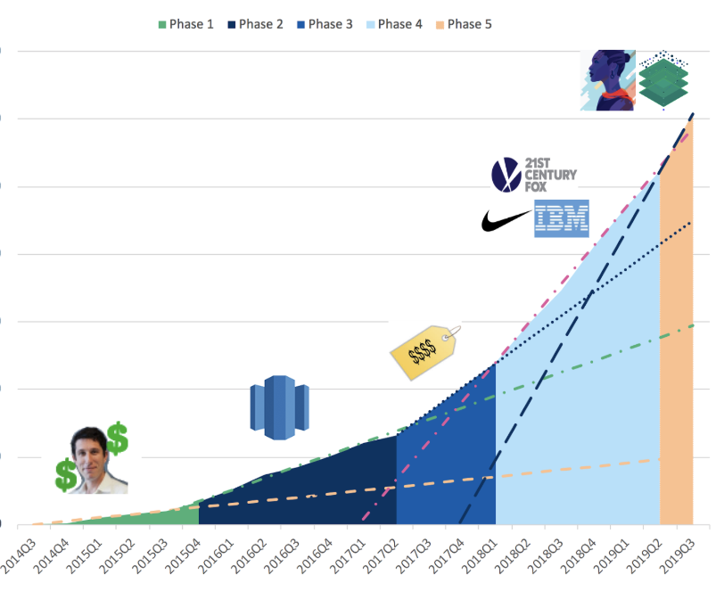
Segment's revenue graph runs on top of Mode Analytics, which is querying Amazon Redshift. Our ARR query is hundreds of lines long and has been iterated on by dozens of people to increase accuracy. But when you can keep it simple, please keep it simple!
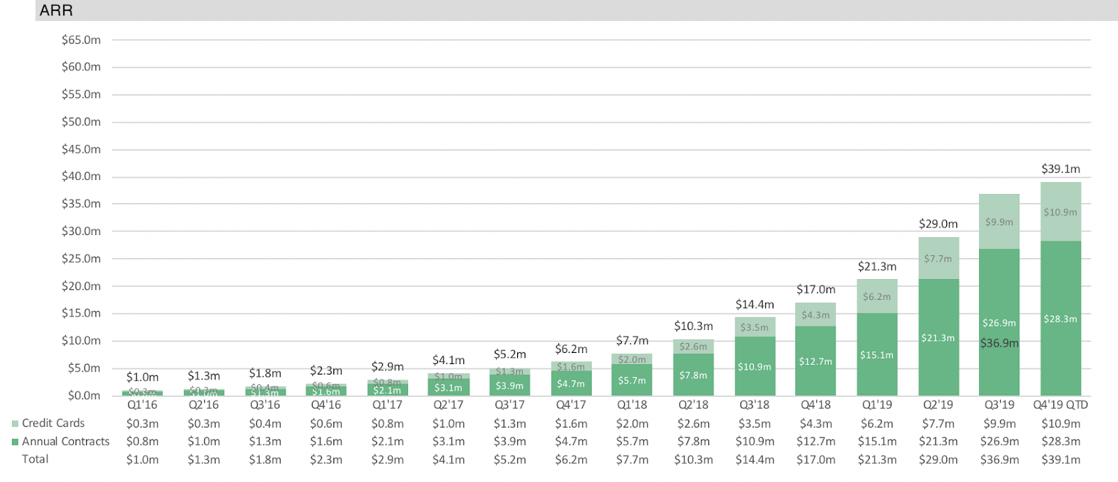
Furthermore, we track our revenue slope and notice whenever the slope inflects to a higher or lower rate. Revenue inflection points are often associated with a really well executed new product or business strategy. Check out the Data as Motivation article to learn more about how this graph is used.
Dashboards
Now that we've assembled an amazingly valuable group of metrics, it's time to make them actionable. Here's the trick: 1. Set goals against each metric you want to focus on. 2. Assign an owner to each metric/goal. 3. Distribute a dashboard with the metric/goal.
There are two metric distribution methods we recommend folks to start with.
Realtime dashboard (with a shareable URL)
Investor email
1. Realtime dashboard
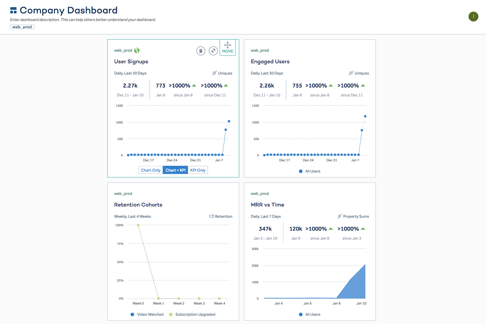
A realtime dashboard updates automatically and is shareable between team members via URL links. This type of dashboard is the most powerful for motivating and focusing a team around a metric objective.
You can use Amplitude to create a realtime dashboard and add the same metrics you added above. Use the Chart + KPI option to graph each metric.
A few best practices around dashboards:
Dashboards should be viewed as products that need product market fit. Team members engage with the best dashboards every single day. They track the KPI against their goal, and cheer the line forward. Dashboards that lost viewership over time do not have product market fit. In a very meta move, Segment actually instruments analytics on dashboards to understand whether they have product market fit.
The best dashboards are used in All Hands meetings and in emails.
2. Investor/stakeholder email
Another level of metric accountability is the investor/stakeholder email. We recommend companies send an investor/stakeholder email once a month with the month-over-month or week-over-week core metric changes highlighted:
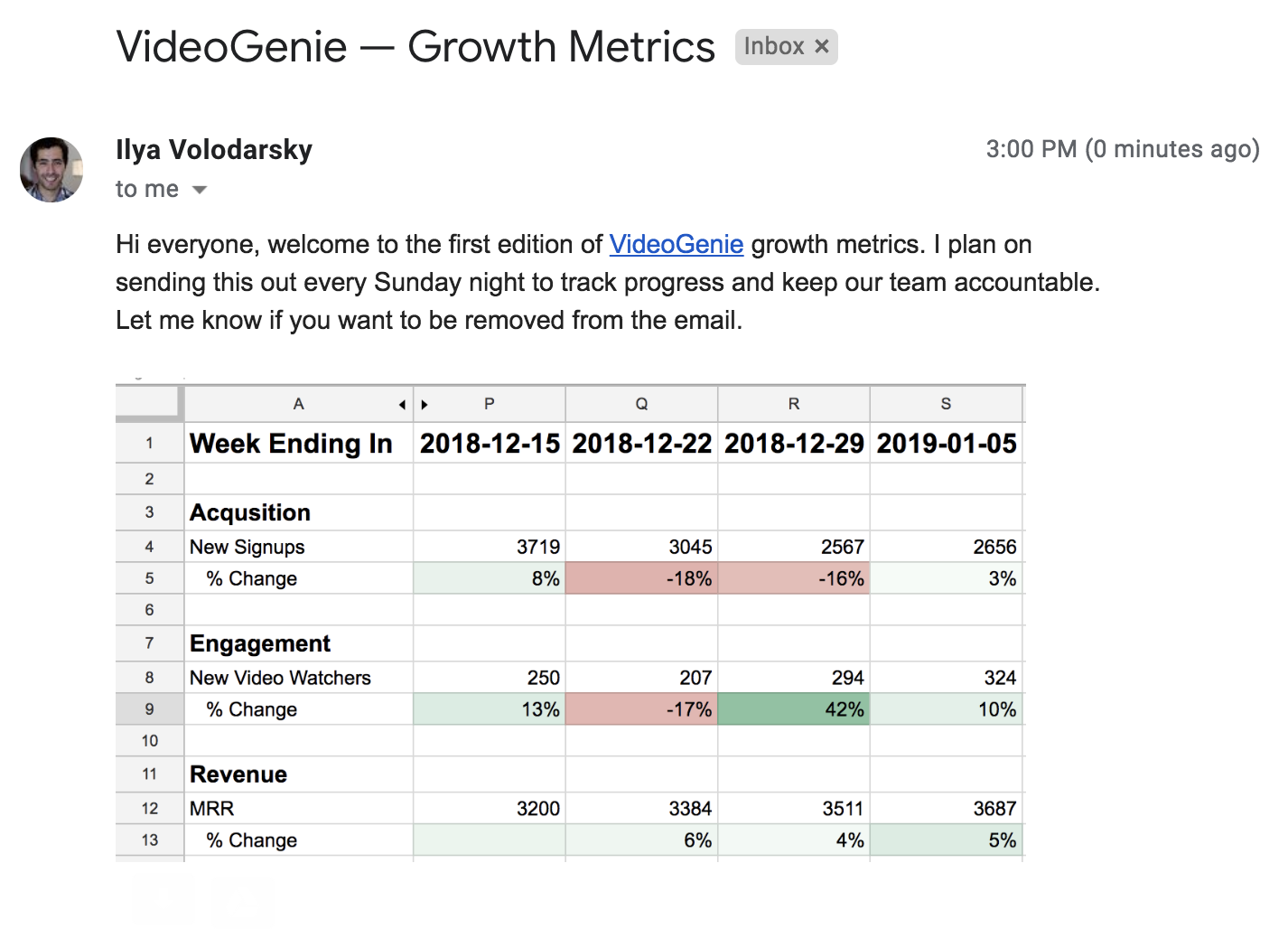
The benefits become clear immediately: the company/team gets instant accountability for driving and focusing around the target metrics. The investors also have the opportunity to help against projects/initiatives that the team is employing against the metrics.
Quickstart complete
We just had a lot of fun, and now our analytics stack is fully setup. We set our business goals, designed our first funnel, collected data from our web/mobile apps, built our first metrics, and distributed our first dashboards. You should be proud for doing so much in so little time, what an age we live in!